Sellers Hub
Website Redesign · Direction Review

Three premium directions. Same brand, same story.

Pick the look that feels right. Every version uses the locked brand colors and the same verified copy — the only thing changing is layout, space, and polish.

Each is a full, scrollable home page. Open them and scroll. Client testimonials and logos are clearly marked placeholders, pending the final website content.

Editorial Executive direction preview
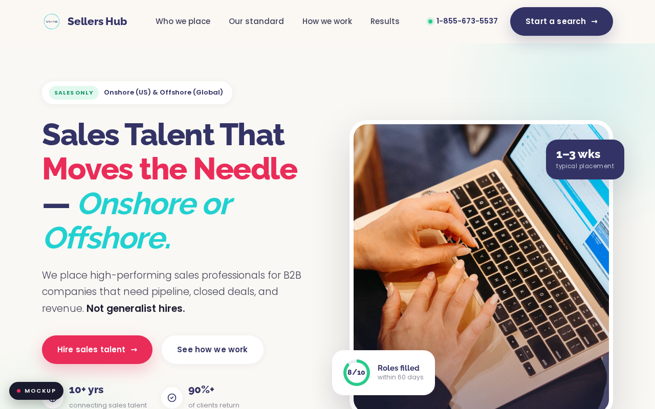
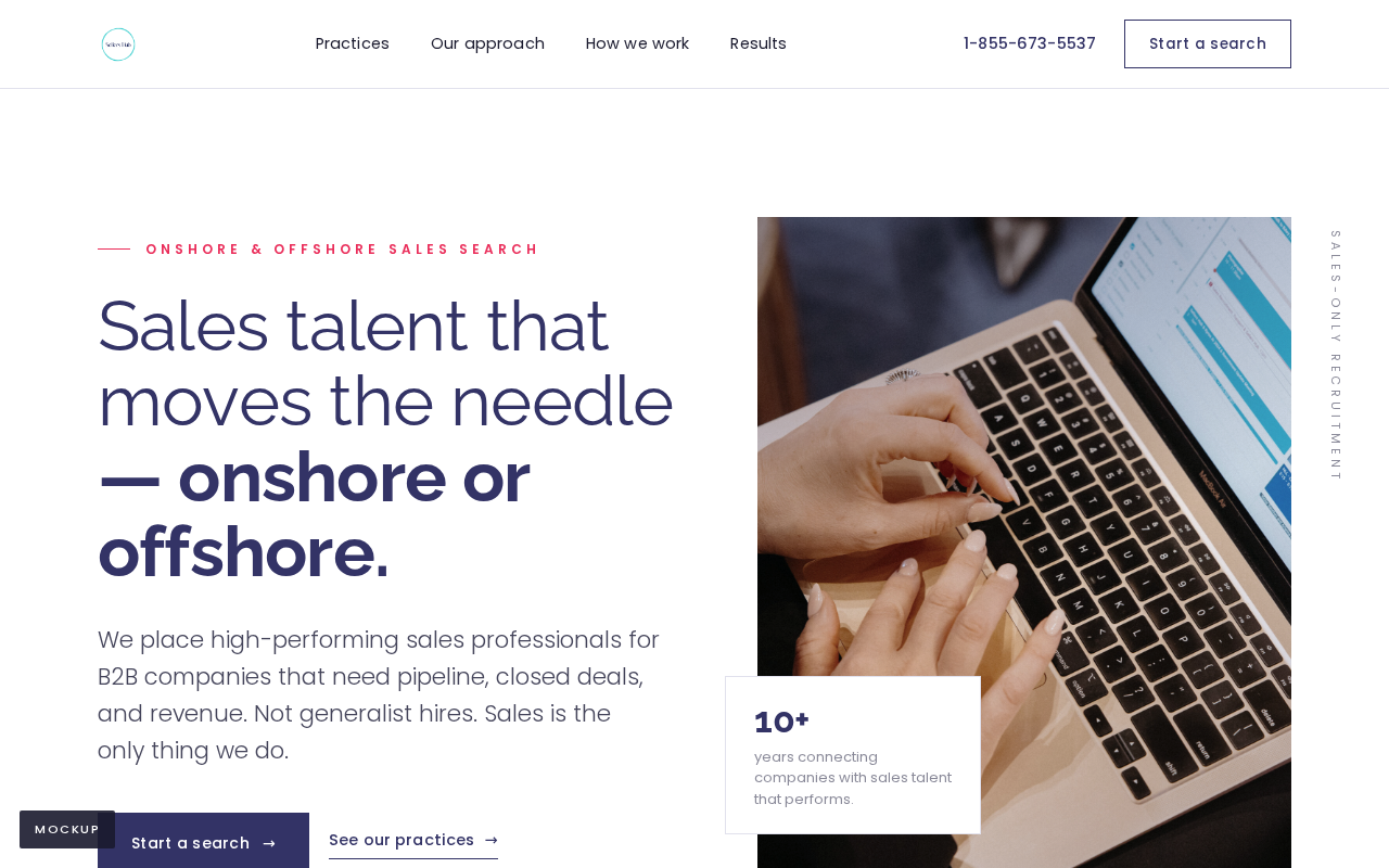
Option A — Editorial

Editorial Executive

Calm, whitespace-driven, and authoritative — the register of a top executive-search firm. Indigo and white dominate; restraint is the luxury signal. Reads established and expensive.

Open full page
Modern Tech direction preview
Option B — Modern

Modern Tech Premium

Dark immersive hero, subtle motion, gradient accents — the polish of a top SaaS site. Sharp, modern, and high-energy. The most contemporary of the three.

Open full page
Warm Boutique direction preview
Option C — Warm

Warm Premium Boutique

Warm off-white canvas, soft rounded photography, testimonial-led. High-touch and personal — premium but approachable. The friendliest of the three.

Open full page
Baseline preview
Baseline — brand-faithful
Closest to today's site structure, cleaned up. For reference / comparison only.
View baseline
What's real vs placeholder: all stats and claims are pulled from the live site and are verified — 90%+ client return, 80%+ hit first-year budget, 8/10 roles filled in 60 days, the three ICPs, the SELLER framework, the $700K result (kept unnamed). No invented client names or numbers. The testimonial quote and client-logo strip are placeholders waiting on final content.

Brand: colors and fonts are unchanged per the 18-06 call — this is a layout, structure, and speed redesign, not a rebrand.